Does architecture tell a story?

Simply put: yes!
With each concept, design and building, architects tell a story. Whether the building is a new home, an apartment building, or just the fit up of a commercial space, we tell a story about the client, the function of the space or the community it sits in. Successful buildings do all three.
Every part of the building tells that story. “God is in the details” is attributed to Mies van der Rohe. Its through the details that we see the story of the building. How does the door handle of the shop feel in your hand? Is it intuitively designed for push versus pull? Does the colour of the door handle match the frame and how does it relate to the colours, textures or feeling of the rest of the building?
But beyond the details, how does the building tell its story? Does it embrace the community as a whole with a positive relationship to neighbours, the street frontage and surrounding context? How does the building design relate to its historical context, or does it ignore that context anticipating how the community will change? These are important questions.
When we pick up a book, especially a work of fiction, we are transported to the author’s imagination. Who else has pictured themselves wielding a wand in the streets of London? Or riding the back of a dragon on the fantasy planet of Pern? We are grateful to J.K. Rowling and Anne McCaffrey for their imagination, and ability to create a world for us.
We spend the bulk of our lives in, or around, buildings. We need to be inspired by the stories they tell us. When we walk into the LeBreton Gallery of the Canadian War Museum (Moriyama Teshima and Griffiths Rankin Cook Architects) we are transported to an alternate reality…the sloping, board-formed, concrete walls bring us to the theater of war and reinforce the idea that we must never forget.
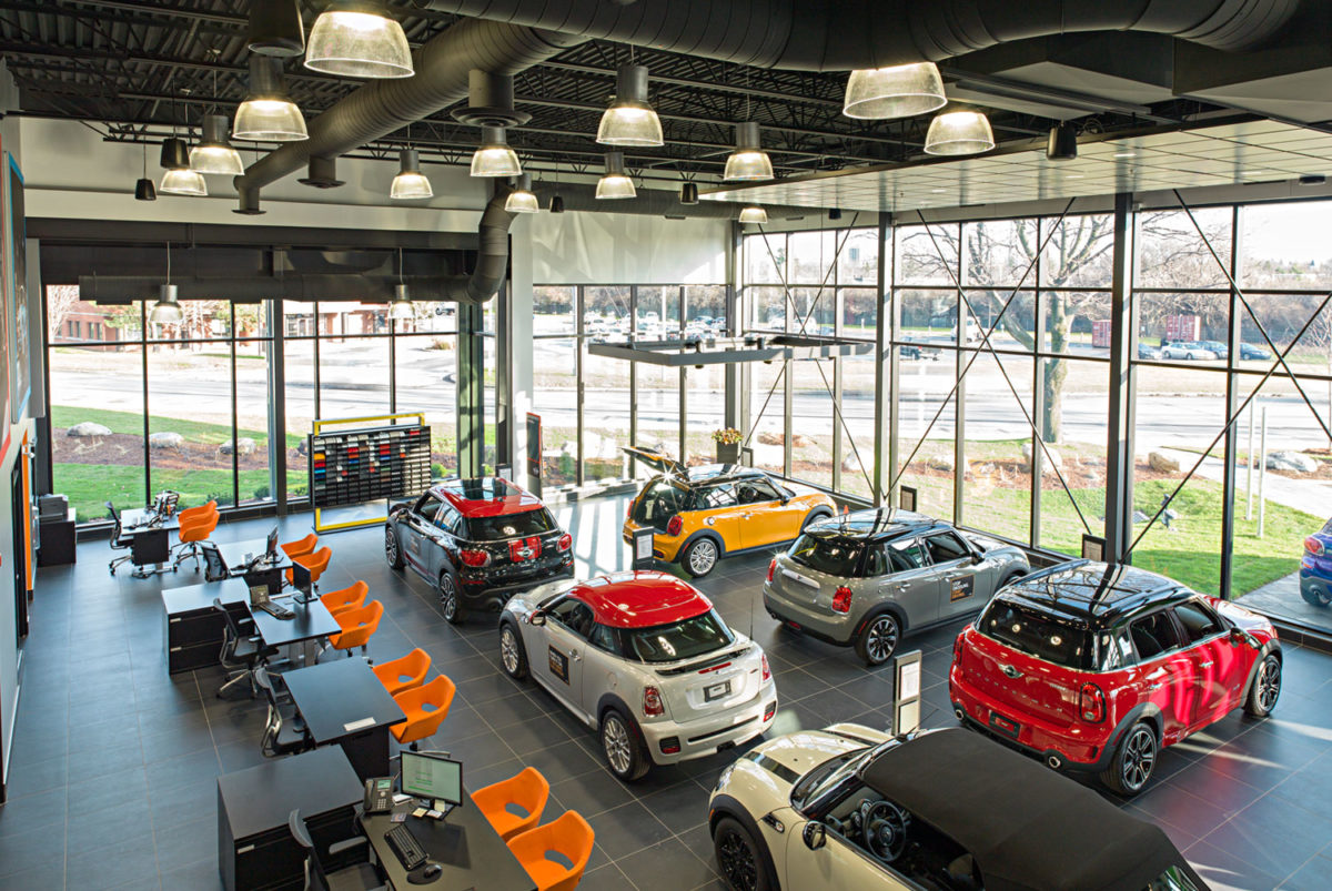
When we set about designing the new MINI Ottawa dealership on Carling Avenue, a much more humble building by comparison, we set about to tell the story of MINI. We started with the basic framework provided by the corporate branding: bold colours set against a black background with changes in form, mass and height. We took over this idea and pushed the relationship of street/pedestrian and traffic; bringing the visitor’s eye inside. We designed the interior to have specific patterns of tile, use of colour and double height space to create changes in vision and view. The second level lounge, a late design change, created vistas out to Carling and overlooking the MINIs in the showroom. Consistency of colour, pattern, furniture and material tell the story that MINI tells: fun, vibrant, exciting! You can recognize a MINI in a parking lot easily, we wanted the building to reflect that character and never have someone wonder if the building served a different purpose. No one will ever wonder if you can buy a Buick in that building.