Colour in Architecture – Sheldon’s trip to Japan

Colour is an integral part of our environment. It is a critical part of survival in nature that various animal and insect species have more colour-receptor cones to detect more variations which they rely on to find safe food sources, mates, and even to camouflage themselves from predators. In spring and summer, beautiful shades of green appear as grasses and leaves grow and mature throughout the seasons. Flowers planted with care in people’s gardens dazzle as vibrant rainbows. In autumn as plants begin to die, colours change from bright yellows, oranges, reds, to eventually turn brown. The next time you go out for a walk, pay attention to how colourful your surroundings are and consider where colour appears most frequently. For the built environment, you’ll likely find them used on signs and advertisements vying for your attention. Buildings may occasionally be adorned with colourful awnings, doors, or roofs; and if you are in one of Ottawa’s older neighbourhoods you may find them in the colourful building materials. Both nature and our built environment are filled with colour; yet, increasingly there’s a trend in architecture and interior design to avoid colour altogether in an aim for more muted and “calm” spaces. This has ramifications for how our neighbourhoods look and feel.
I took a trip to Japan recently, and on this trip, I specifically sought some of the work of an architect whom I admire. Emmanuelle Moureaux is a French architect living and working in Tokyo with projects that span disciplines from architecture and interior design to fashion, art, and industrial design. The most important design feature she focuses on is colour. She has a word she made-up to describe how she transforms space: shikiri (色切), defined as “dividing and creating space through colours.” The use and layering of colours change one’s perceptions of space and can influence emotions. She came to focus on colours when she took a trip with her school to Tokyo and was amazed at the vibrancy and colourfulness of the city. She employs a wide array of colours in her palette in different hues and gradients. She often pairs them with white materials or light wood – which make colours appear more vibrant – to draw one’s eye.
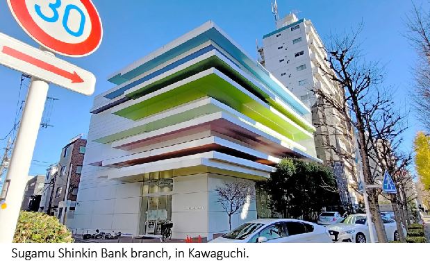
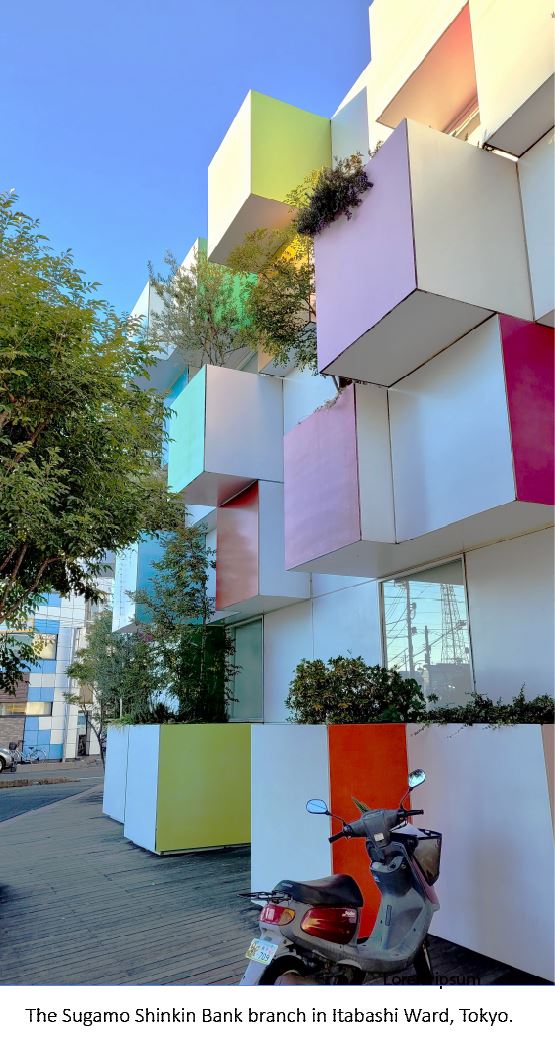
Two buildings I wanted to see were branches of the Sugamo Shinkin Bank. The first is the Shimura Branch in Itabashi Ward in Tokyo. It’s referred to as a “rainbow mille-feuille” for its distinctive layering of panels of different sizes similar to the French dessert of the same name. Most of the building is white, but the underside of each panel, visible to the pedestrian underneath, features a different colour and overlaps the next. It’s a treat for people passing by who happen to look up. The second building is located in the neighbouring city, Kawaguchi. The Nakaaoki Branch features a greebled façade where rectangular blocks project in different patterns and have alternating surfaces covered with different colours. Some blocks function as planters for small vegetation shading square windows in behind. I didn’t have a chance to go inside either, but you can see more of her work on her website. 
Her work is refreshing amidst other projects featured in architecture magazines. It’s not common nowadays to see colour used despite advancements in materials that could better integrate colour in architecture. Canada, and Ottawa in particular, is quite conservative as we tend towards duller shades like greys, whites, blacks, and beiges or browns. On the rare occasion that colour is used only a small amount is employed as an accent for an exterior façade or interior wall. Other cities are more playful with colour and even based identities on colourful buildings. St. John’s, Newfoundland and other parts of the Maritimes are famous for their “jellybean houses” where each house has a different colour. La Boca in Buenos Aires, Argentina is known for its colourful houses as well, allegedly due to fishermen using leftover paint from their boats for their houses. The island of Burano in Venice, Italy also has colourful houses for similar reasons as La Boca and St. John’s. Notice how much of a tourist draw these polychromatic places are. Montréal’s Le Plateau neighbourhood is known for painted rowhouses with ornate, multi-coloured gables and balconies. There’s a requirement where homeowners must ensure that their homes are painted different colours from their neighbours. Even older buildings in Ottawa have some colour to them. Many older homes are constructed with rich red bricks (and occasionally painted porches or sunrooms), which look warm and comforting amidst white, wintery snow.
 In 2002, architect Mario Saia replaced the western side of the Palais des Congrès in Montréal with a façade made of 390 panels of coloured glass, showing one way architects can incorporate colour into modern architecture. During the daytime, the coloured panels flood the interior in rectangles of colour, while at night the interior-lit atrium illuminates them for people passing on the street. It has become popular for people taking photographs. In a similar manner, artist and architect Hal Ingberg design a colourful glass wall art installation called “Papa” in Hull at the corner of Boulevard des Allumettières and Maisonneuve which projects its colours on the snow in winter.
Many buildings today are built with grey, black, white, or other dull monochromatic materials. Many look almost identical to one another, often because they are designed or built by the same architects and developers. These buildings visually impact our neighbourhoods and affect not just those who work or live within, but also people passing by on the street.
What do these shades look like in winter – a season largely devoid of colour? White snow blankets everything for the five months and mixes with dirt and car runoff to make gross brown and grey clumps. Sometimes the sky may be a bright blue, but it’s regularly overcast and depressingly grey. How do buildings without colour affect people under these conditions? What if every building on the street looked the same – how much more depressed and unattached to our neighbourhoods might we be?
Buildings stand for decades and, if built well, even last for centuries (though it’s doubtful newer buildings will last as long). Should we really allow ourselves to be stuck with depressing and uninspiring buildings? Maybe instead we should take a page out of Emmanuelle Moureaux’s book and use colour more abundantly to make more pleasant buildings and neighbourhoods.