What Robert Venturi taught me

On Tuesday, September 18, 2018, the world of architecture mourned the passing of the, “father of postmodernism”, Robert Venturi at the age of 93.
Robert Venturi graduated from Princeton University in 1947 and again in 1950 with a Masters of Fine Art degree. Along with being an architect, he was a noted writer, teacher, artist and philosopher. In 1991 he received the Pritzker Architecture Prize, one of the most significant awards in the profession.
From his essay, A View from the Campidoglio, “When I was young, a sure way to distinguish great architects was through the consistency and originality of their work…This should no longer be the case. Where the Modern masters’ strength lay in consistency, ours should lie in diversity.”
This quote speaks true to me in my role as an architect. When designing a building, I always try to add some whimsy, colour and alteration of form; especially since so much of our contemporary architecture is boxy or rectilinear, a splash of colour, accent or bit if whimsy is essential. A splash of colour, and a change of view can make a building come alive.
I’m no Robert Venturi, and can only hope to have as profound an impact on the world as he has. But I learned a lot from his writings. We read his work in school, and talked about the role of Contradiction and Complexity in Architecture, his most famous book, as key to design. At the time, as a student, I admit I didn’t really get it. But I get it now.
When Alex Bozikovic speaks to the mediocrity of contemporary architecture, and the procurement process that is the root cause of this, he’s, in a way, talking about the boring banality of “design by spreadsheet.” The designs can be uninspiring, boring, and lack the sense of whimsy, beauty or refinement that is needed to make architecture matter. When he writes about the computer design driven office space of, of all things, the Autodesk Canada offices, and the awkward space created, this isn’t whimsical, its architects giving up their sense of design adventure to a computer.
Likewise, when Shawn Micallef writes about the A blue-glass attack is eroding Toronto’s highrise style, he’s talking about the same thing. When beautiful buildings have their glass replaced with the same boring blue glass, the architecture suffers. All the buildings look the same. There is an absence of style, interest or unique beauty that makes one building stand out from the other. Architecture needs to be of its place, and of its time. Think of that next time you go to a suburban mall: how unique is the one in Ottawa, from the one in Belleville, Kingston or Vaughan? Not much. The same tones of beige stucco, same colour brick, identical big-box signage is boring, and robs the public of beauty, character and quality.
We, as architects, need to spend the time it takes to make architecture exciting. And the public needs to see that interesting, innovative design breathes life into cities. It makes cities exciting places to be. That a sense of whimsy, a splash of colour, a bit of well thought out quirkiness is okay. And should be celebrated.

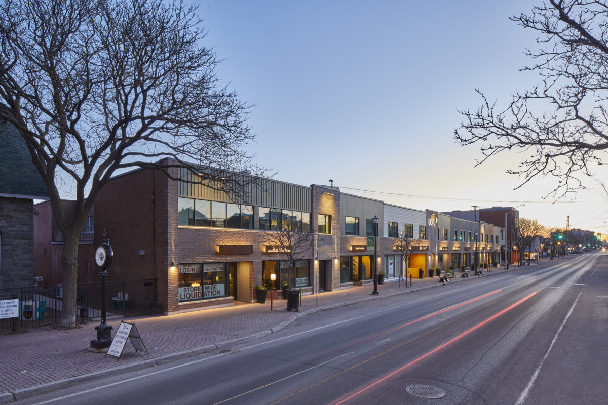
Photo: Richmond Façade