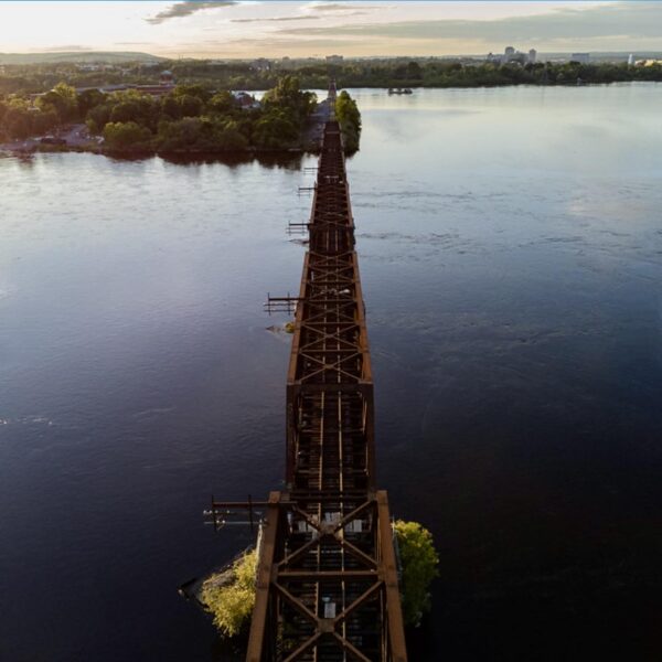
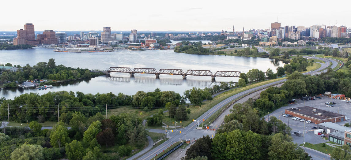
Finally in late 2020, the City began exploring ways to adapt the bridge to active transportation; aligning with the policies and public will and ensuring the safety of those crossing the bridge.
The City had an opportunity to create something incredible for this site. The City could have held a design competition to solicit ideas. Some limited consultations were done, largely after concepts were developed through a sole-source contract drawn from the City’s standing offer list of civil engineering firms.
Now, don’t get me wrong‑ what has been built is decent, nice even. But it falls short of excellence, revealing the limitations of our thinking and a reluctance to invest in creativity.
Benches are generic City benches that, as
ide from being hostile architecture, are placed without thoughtful placement for views, seating circles or encouraging conversations.
Railings are added but constructed of cables which will stretch or sag over time and require retightening; that maintenance is something the city is generally terrible at doing, resulting premature failure of our investments in the public spaces and buildings. Worse, the railings can be climbed, doing little to prevent someone from climbing up over the edge and jumping into the water below.
Signage isn’t infrastructure. While there are signs warning people of fast-moving water, they have the same effect as paint to show that there is a bike lane. Someone committed to jumping isn’t going to be stopped by a sign. We could have created a railing system that served as a barrier to people jumping, not unlike the Luminous Veil crossing the Prince Edward Viaduct in Toronto.
The lack of historical context for industrial architecture is a missed opportunity. The remaining rail tracks on Lemieux Island could have been adapted, offering a story akin to the High Line in New York with rolling benches on the rails and other features to tell the story of our industrial heritage.
The rail bed was retained in its original width. Proposals including those from Bike Ottawa suggested cantilevered sections to allow year-round access and broaden the opportunity for multiple uses.
 In doing so, the City doesn’t meet its own accessibility standards that call for a rest area every 30m along a path. While the bridge deck is a comfortable 5m in width, if someone wants to stop and enjoy the view, there is nowhere to sit. There is nowhere to stop and lean on the railing without forcing others to go around you. A cantilevered projection could have offered places for people to sit or to enjoy the view. Imagine the tourism impact if we designed better?
Should someone be in distress or think that they are a strong swimmer and decide to jump in the water, there are no emergency call buttons.
That the bridge is closed for winter is a sad culmination of our lack of design thinking.
Claims that the wood deck can’t be maintained by plows is a hollow argument, given the Alexandria Bridge has a similar wooden deck for pedestrians and cyclists, as does the Minto Bridge for cars. Perhaps part of the excuse for winter closure stems from questions about where to pile the snow, or a lack of curb along the edge to guide the plow blade. Both are a failure of design.
The assumption that active transportation is merely recreational ignores the reality that many rely on it for daily commuting. We’ve spent $22.6m to create a seasonal commuter connection. Imagine if we spent that on a road but closed it for winter?
While the bridge is acceptable, it’s great only in comparison to nothing. And that’s a low standard.
We need to think about design, its impact on people and how they experience the city. We need to see value in creating experiences, making places accessible and investing in active transportation for year-round use. We need to make the link between better places for people and our local design community, tourism, the economy, and value for money.
Mediocrity falls short of our expectations. It’s time to aspire to excellence.
